Generation of colors in the color system
This post takes you through the journey we went through to develop our own approach to color generation, and how this system works today
It can be challenging to create harmonious color scales programmatically - scales that are pleasing to the eye and work well in a color system with respect to contrast and accessibility. Colors can easily end up looking wrong or lacking balance. Perhaps they become too saturated in the upper scales, or simply don't harmonize when put into practice.
What we envisioned was to create a tool where the user could choose a color, and create a color scale based on the color in lighter and darker values.
Pleasant color scales for humans
There are many different ways to create colors. There is a sea of color spaces and techniques available that solve many different needs. For Designsystemet, we were looking to create colors that looked beautiful and balanced to the eye. By this we mean how light affects colors in a controlled environment.
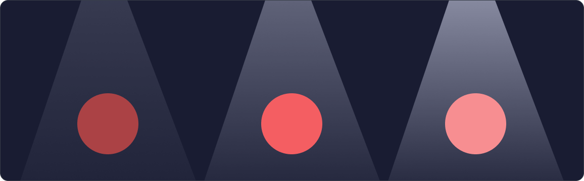
In the image above, a red color is hit by light of varying intensity. This shows how a red color is affected in a controlled environment in a dark room. Less light will give a darker color, while more light will give a lighter color. This in turn affects how the entire color behaves and looks, both in terms of brightness, hue, and saturation. This was the starting point for how we wanted to create the color scales. By mimicking how light affects colors in the real world.
Different techniques for creating color scales
Two of the most common ways to create colors are by using the RGB and HSL color spaces. We'll now take a closer look at how these methods work and how the results look. In the examples, we use Digdir's red brand color as a starting point for creating the scales. The reason we chose this particular color was because it worked well to showcase the issues and effects of color generation.
RGB color space: shading and tinting
A color in the RGB color space consists of 3 color channels: red, green, and blue. These can have values from 0 to 255, where 0 is completely black and 255 is completely white. Different combinations of these three values give us all the colors we see on our screens.
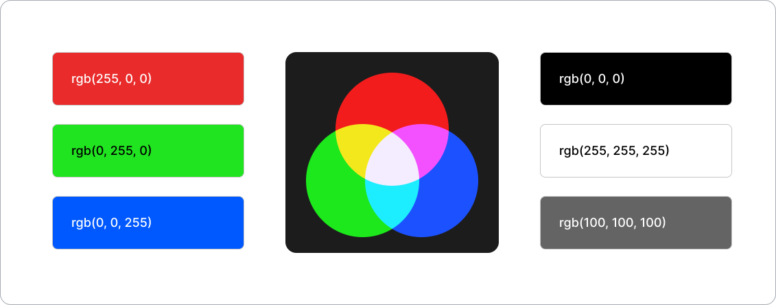
To create a completely white color in the RGB color space, all three channels must have the value 255 rgb(255, 255, 255), while a completely black color has all three channels set to 0 rgb(0, 0, 0). If you want a gray shade, the channels can be set to equal values.
It's common to use a technique called "shading" and "tinting" when working with colors in the RGB color space. Shading is adding black to a color to make it darker, while tinting is adding white to make it lighter.
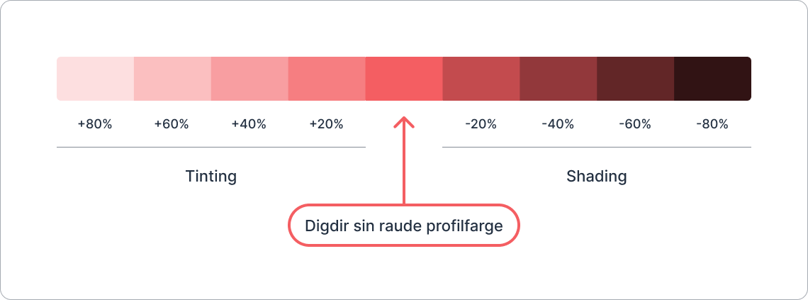
If we take Digdir's red brand color rgb(243, 95, 99), (light red), and want to make it darker, we can reduce the values in the red, green, and blue channels towards 0.
How we choose to reduce these values affects how the color ends up looking.
In the image above, we've taken Digdir's red brand color and added 20% white and 20% black to the channels to create different values. We thought this created nice colors because it mimicked how light affects colors in the real world and how we humans perceive them.
HSL Color Space: Hue, Saturation, and Lightness
The HSL color space (Hue, Saturation, Lightness) is a way to represent colors by dividing them into three components:
- Hue describes the actual color and is given on a scale from 0° to 360°, such as red, green, or blue.
- Saturation indicates how intense or grayish the color is on a scale from 0% to 100%.
- Lightness determines how light or dark the color is, from 0% (black) to 100% (white).
There are several techniques for creating color scales in the HSL color space. In the examples, we'll look at some of these techniques and how they work.
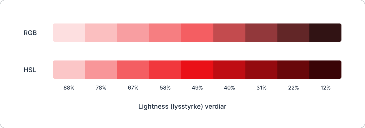
A common method is to adjust the lightness of a color to make it darker or lighter. In the image above, we've taken Digdir's red brand color and set fixed lightness values to create different shades. Compared to the RGB technique, we see that the colors became much more saturated in the upper scales. This makes sense because we didn't adjust the saturation values. This clearly shows a challenge with many of the color spaces that use lightness to define the brightness of the color. If we change this value, the colors often end up looking oversaturated and unbalanced.
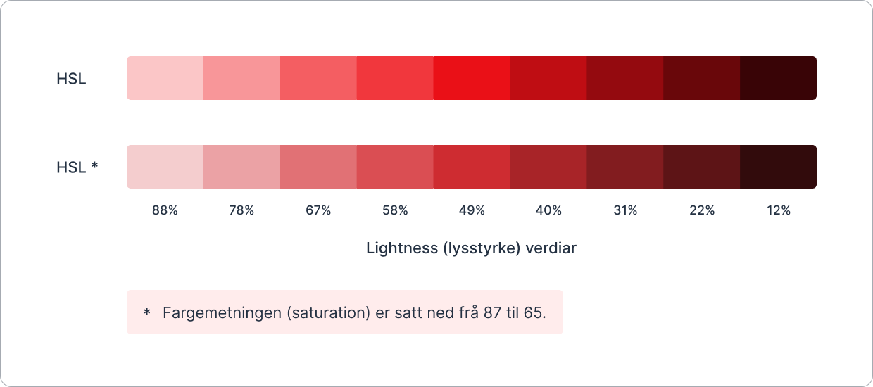
Another method for creating color scales in the HSL color space is to adjust both the saturation and lightness values. In the image above, we've still taken Digdir's red brand color with fixed lightness values. In addition, we've set the saturation value down from 87 to 65 on all the colors (Digdir's brand color had 87 saturation).
Reducing the saturation value on all colors helps, but the problem is that we lose the original color that was used to create the color scale. For us, it was important that this color was still included, as it can often be an important color for the user.
Fixed saturation values across the colors didn't work well in practice either. We found that very complex logic had to be written to get colors with different hues to work well together. Here, the RGB technique was much easier to work with, and created much better colors.
What about the other color spaces?
After trying out the RGB and HSL color spaces, it was time to look at the other color spaces.

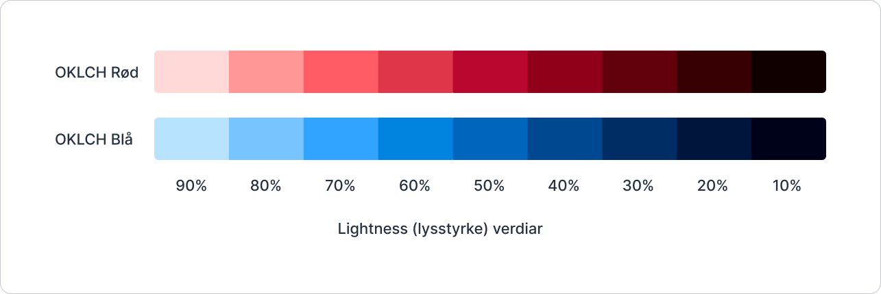
In the image above, you see color scales based on Digdir's red brand color in different color spaces. Many of these color spaces use lightness to define how light a color is. We experienced many of the same challenges with these color spaces as with HSL: that we had to write a lot of code to get colors with different hues to work well together.
One color space that we were quite happy with was the OKLCH color space. It created nice and balanced colors, but we found that the colors sometimes became too saturated for certain hues. The conclusion after evaluating all these color spaces was that the RGB color space proved to be the simplest and best method for creating color scales, and that gave us the colors we were looking for.
But how could we put this together in a system that creates color scales based on contrast and accessibility?
WCAG and public websites
Our approach to developing the color system was to ensure that everything we did met all AA requirements in WCAG. At the same time, we wanted to reach for the AAA level where it made sense and didn't compromise the design. To meet AA requirements, there must be a 4.5:1 contrast between text and background for small text, and 3:1 for text that is larger than or equal to 18 px. For interactive and graphical elements, the limit is 3:1. As of 2025, regulations state that public websites must meet all AA requirements in WCAG.
How WCAG calculates contrast
When WCAG 2 calculates the contrast between two colors, they use a formula that is based on the relative luminance between the colors and gives the colors a score.
This score indicates how good the contrast is. If the colors have the best possible contrast, the score is 21:1; if the colors have no contrast at all, the score is 1:1.
Luminance describes the perceived brightness of a surface and is used to assess how much light is reflected or emitted in a particular direction.
Relative luminance is a normalized value that ranks the luminance of a color between black 0 and white 1. This value is calculated based on the red, green, and blue components of the color, with green contributing the most to the perceived luminance.

In the image above, there are two colored backgrounds with black text.
The contrast between both colors and the black text is 6.6:1, and the relative luminance of the colored backgrounds is 0.28. The fact that these two values are the same shows that WCAG uses the relative luminance between the colors to calculate the contrast.
Color space based on contrast
As mentioned earlier, there are many color spaces that have a lightness value that shows how light a color is. In some of these color spaces, it means that colors with the same lightness value get approximately the same contrast. Two color spaces that achieve this are HSLuv and OKLCH.
The HSLuv and OKLCH color spaces
HSLuv and OKLCH create colors that are better adapted to human color vision. HSLuv adjusts the colors so they stay balanced, even in the RGB area, while OKLCH uses a newer model that gives more precise and even colors. Both make it easier to create nice and harmonious colors, but OKLCH is more accurate.
In the image above, two color scales are shown in the OKLCH color space, both based on Digdir's brand colors. What's particularly interesting is that the colors with 70% lightness in the scales above have almost identical contrast against black text. This means in practice that you can generate as many color scales as you want, and ensure that the contrasts between the different steps in the color scales will always be the same.
The OKLCH color space created nice colors and worked very well to ensure that the contrast between colors was the same across color scales. The unfortunate thing was that the colors sometimes became too saturated for certain hues.
What if we could combine the RGB color space with OKLCH to ensure that the contrasts were the same across color scales? To do this, we first need to talk about interpolation.
Interpolation of colors in the RGB color space
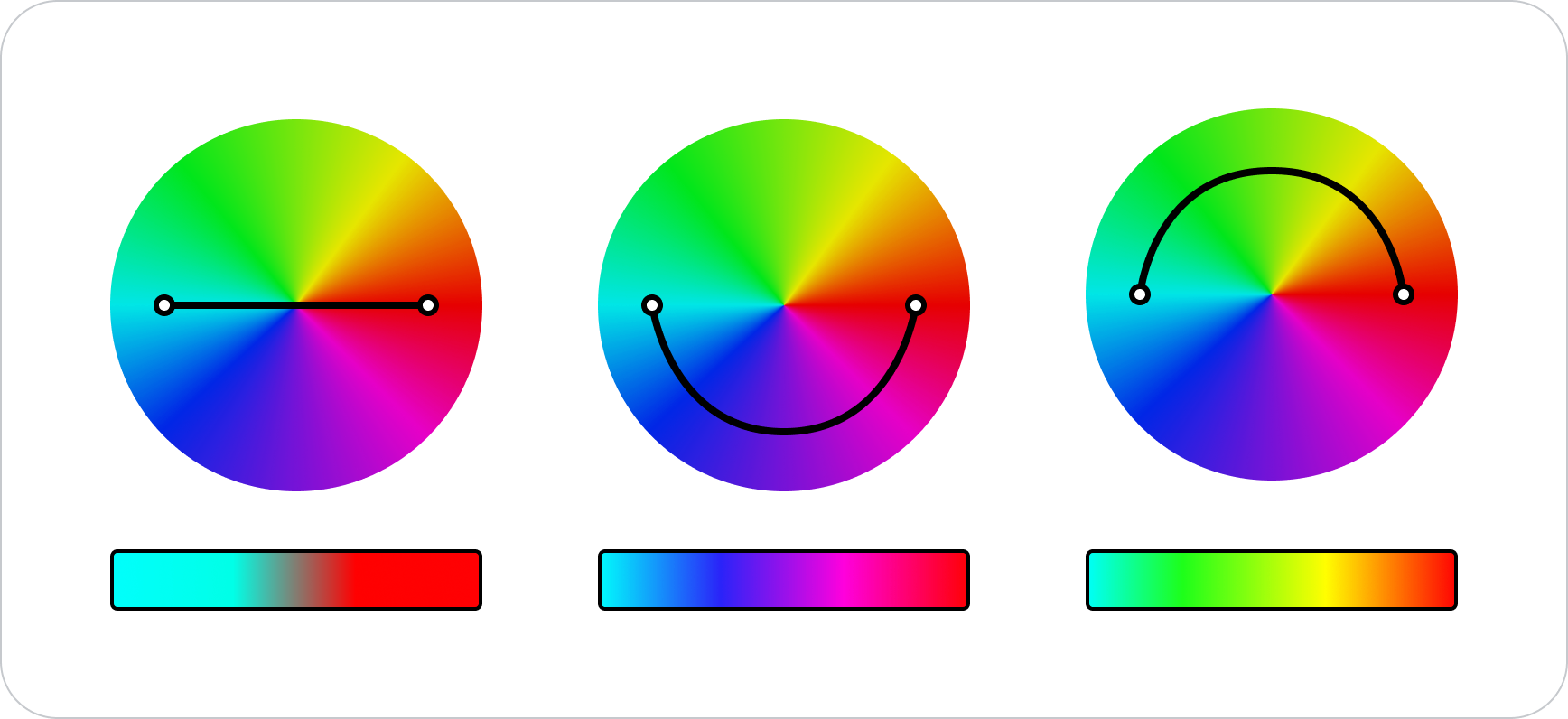
Interpolation is a mathematical method for estimating values between two known data points. It is often used when working with a dataset and wanting to estimate values between existing data points. Color interpolation is about drawing a line between two points in a given color space. The result varies a lot depending on which color space is used, and whether the line is straight or curved. In our case, it was about drawing a line through the RGB color space.
We already knew that WCAG used relative luminance to calculate the contrast between two colors. To ensure that the contrast between two colors is always the same, the relative luminance must also be the same. Our goal was to find luminance values in the RGB color space by adjusting the colors through "tinting" and "shading" until we achieved the desired luminance. Moving iteratively through a color space in this way is a form of interpolation.
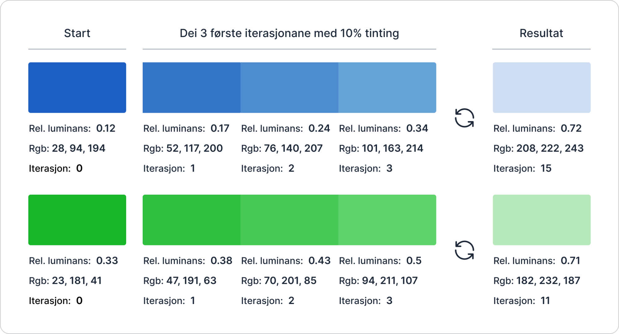
In the image above, there are 2 colors on the far left with luminance values of 0.12 and 0.33. These colors serve as the starting point for the interpolation.
The goal in this example is to find the luminance value 0.7 for both colors in the RGB color space, which you can see on the far right. To do this, we first need to look at what luminance values we have to work with in the colors on the far left. Both of these values are lower than 0.7. We therefore need to "tint" the colors to get them to approach 0.7.
In the example above, we "tint" the colors by 10% over and over again, until we achieve a luminance value that is as close to 0.7 as possible. In iteration 3 of the blue color (the color just to the left of the result), we see that the luminance value is 0.34. This is still not close to 0.7, so we need to continue "tinting" the colors. After 15 iterations for the blue color, and 11 iterations for the green color, we have found the closest luminance value to 0.7 that we can with this technique.
The goal was to find the luminance value 0.7 for the colors. But as the image above shows, the result was 0.72 and 0.71. This shows how the interpolation works, but it's not accurate enough for our purpose. In the source code, a more efficient method, called binary search, is used to navigate through the color space. This ensures that the result is more accurate and that there are as few iterations as possible. We use the JavaScript library chroma.js to help us with this interpolation.
This is how the color scale ended up looking
The colors are generated by finding fixed luminance values in the RGB color space. With this method, we felt that the colors in each scale worked well together. Color generation for a color scale can be divided into two groups: static groups and a separate "Base" group.
The static groups
These groups used fixed luminance values in the RGB color space to define each step in the scale. Here, for example, all Text Subtle colors will always have the same contrast against Surface Default. This was very useful, because then we could easily create rules on how the colors should be used in the system.
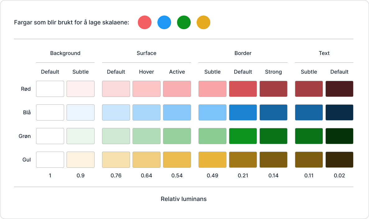
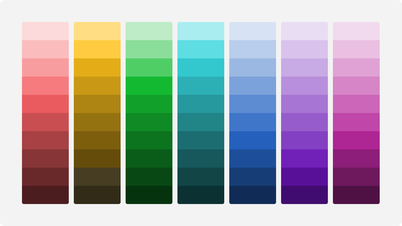
In the image above, you see 4 color scales that are generated based on the 4 colors that you see at the top of the image.
The "Base" group
This group works a bit differently than the static groups.
The color used to generate a scale is named Base Default. It always retains the same "hex code". This ensures that the identity of existing visual profiles with their defined colors can be preserved.
The colors Base Hover and Base Active become darker or lighter depending on the relative luminance of the Base Default color. Simply explained, it means that these colors become lighter if the Base Default color is dark, and darker if it is light. There's a bit more logic happening behind the scenes here, but it's not crucial for understanding how the colors are generated.
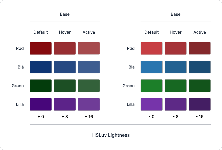
In the image above, you see a section on the left where the Base Hover and Base Active colors become lighter, and a section on the right where the colors become darker.
The way we create these colors is by adding to, or subtracting from, the lightness of the color in the HSLuv color space. The reason we use HSLuv here is because we want the colors to increase in brightness with fixed values that feel natural to the eye.
We found that luminance worked poorly as a basis for saying that a color should become 8% lighter or darker. We therefore needed a color space with a lightness component to help us with this. After we found the lightness value and luminance value of the color, we interpolated the color in the same way as explained earlier.
Further work on color generation and summary
Now we've covered a lot of exciting aspects of colors and color generation. Well done if you've managed to keep up so far! This is a complex topic that often requires a fair amount of insight to fully understand. We hope it has been useful for gaining insight into how our colors in Designsystemet are generated.
Going forward, we'll work on making the colors even more balanced across the color scales. They are a bit too saturated in some of the scales currently. Since we create colors based on contrast, not all hues behave the same to the eye.The color green is dominant in light mode, while blue is very prominent in dark mode. We will therefore work on evening out the saturation for all hues so that they are perceived as more balanced.
We will also continue to make dark mode work better in the color system. In particular, we want to address the issue of certain colors becoming too saturated.
Today we create the colors in the RGB color space, but we will continue to test other color spaces such as OKLCH, HSLuv, and LAB to find the best colors for Designsystemet.
If you have questions or want to know more about how our colors are created, you can contact us on one of our communication channels that you can find at the bottom of the website.