Getting started with Designsystemet in Figma
In Figma, you'll find components, variables, and styles from Designsystemet that you can use in your design. The design also has associated design tokens that are used in the React components. The library is available in Figma Community.
Getting started with components
If the libraries are not already in your Figma organization, you can get the files from Figma Community:
After you've opened them, you must:
- Place the files where you want them in your Figma organization
- Publish the files
- Activate the two shared libraries in the files you're working in
Are you going to use Designsystemet with your own colors and branding? See the guide for setting up Designsystemet with your own theme.
Using the components
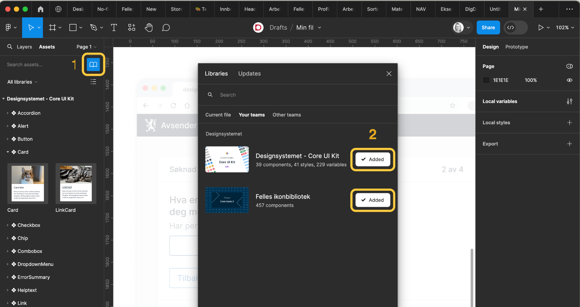
To activate the libraries:
- Click on the book symbol under "Assets"
- Activate "Core UI Kit" and "Felles ikonbibliotek" (Shared icon library)
When you have turned on the libraries, you should be able to see the components by clicking on "Assets" and searching for what you need. You can also use the keyboard shortcut SHIFT + I.
Now you can simply drag the components into your own files!
Want to help create new components? See how you can contribute.
Variants
All components come with different variants and properties. In the Button component, for example, you can activate different weights, states, sizes, and you can also turn icons on and off.
Use Designsystemet with your own brand colors
The components support different brands and modes. To set up your own profiles, see the guide "Design System with your own theme"
Getting started with styles and variables
Styles and variables should be available in the right margin when you need to choose a color, size, spacing, or shadow, for example.
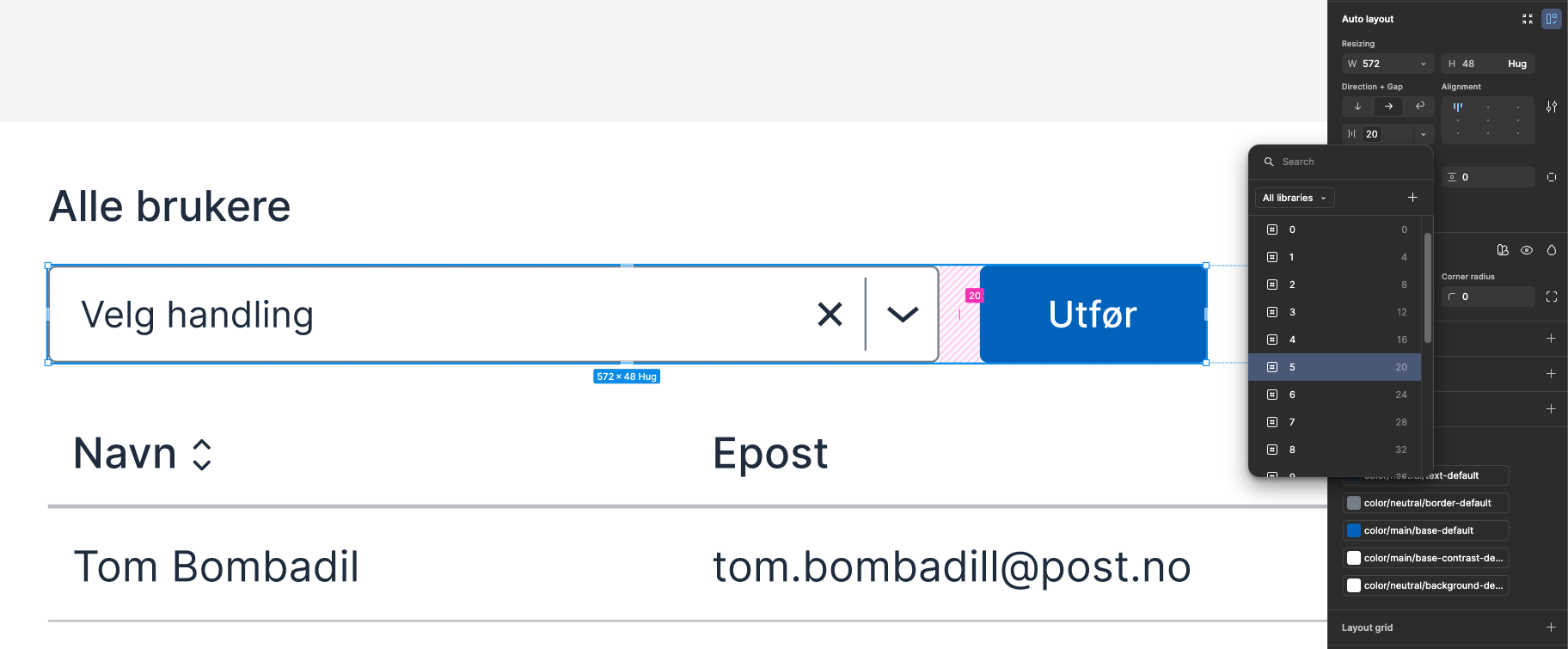
Size variables
Size variables are used to set both spacing and sizes.
Sizes can define width (W) and height (H) of an element, while spacing defines the space between different elements. Spacing is set under "Auto Layout" in Figma. There you can define spacing above, below, next to, or between.
Color variables
Color variables are named according to what they are intended to be used for: background, surface, border, and text.
- If you're looking for a
bordercolor, it can be effective to search for "border" to see all available colors. - If you're looking for a
fillcolor for an element, it can be effective to search for "surface" to see all available colors. - If you're looking for a color for text or icon, it can be effective to search for "text" to see all available colors.
Read more about color tokens and what they are used for.
Typography styles
For all text, you should use typography styles or typography components. This ensures that we have a consistent expression, correct use of spacing, sizes, and weights. Read more about typography.
Rediger denne siden på Github (åpnes i ny fane)